例えば、フロントページ用ののテンプレートを使った場合、左のカラムは上下方向で、センタリングされていますが、コンなのは、どう書けばいいかという事についての説明です。
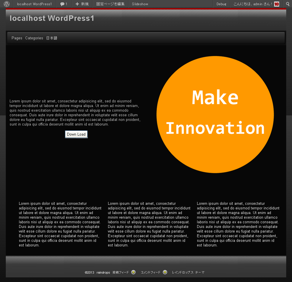
丸い画像の左側のカラムは、Raindropの場合、640pxまでは、ブラウザのサイズにより、約1:1の比率を維持しながら、サイズが変化していきます。
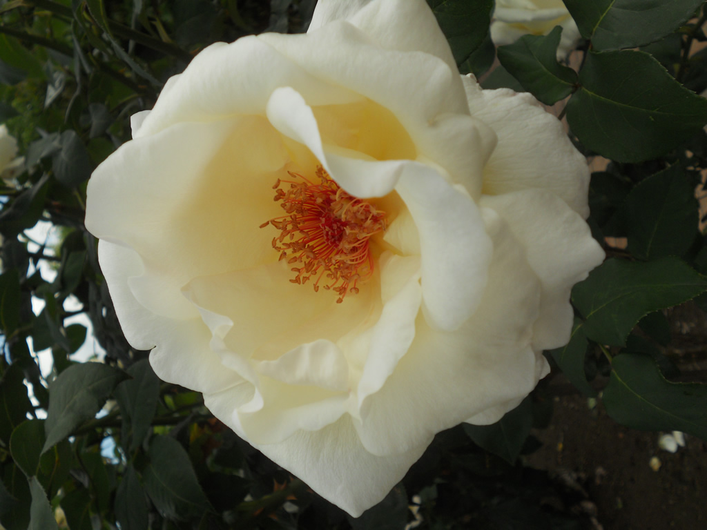
この時、右側の、アイキャッチ画像は、そのサイズに応じて、画像が自動的に拡縮されていきます。
縦方向にセンタリングされているように見えるこの文字列は、如何にして、レイアウトの変化に対応して、縦方向のセンタリングを維持していけばいいのでしょうか?
ベストプラクティスと這い得ないかもしれませんが、対応例を紹介しますので、参考にしてみてください。
左のカラムは、ページの本文になりますが、以下のように記述します。
<div class="content-wrapper">
 <div class="center">
 本文を記述します
 </div>
</div>
次に、このブロックに対するスタイルを指定していきます。
style.css
.content-wrapper{
	background:#900;
	position:relative;
	border:1px solid #000;
}
.center{
	position:absolute;
	left:50%;
	top:50%;
	-webkit-transform: translate(-50%, -50%);
	-moz-transform: translate(-50%, -50%);
	-webkit-transform: translate(-50%, -50%);
	-o-transform: translate(-50%, -50%);
	-ms-transform: translate(-50%, -50%);
	width: 90%;
	background: red;
	color: white;
	text-align:left;
	padding:1em;
	box-sizing: border-box;

}
更に、動的に変化する幅に対して、高さの設定を動的に行います。
カスタムフィールド javascript を作成して、以下のコードを値の欄に入力してください。
jQuery(function() {
	jQuery('.content-wrapper').css('height', (jQuery('.content-wrapper').width() * 0.75) + 'px');
});
0.75の数字部分は、右の画像の縦横比から、同じ高さになるように調整してください。
それでは、以下の設定を行ってその設定を下に記述し、動作を確認してみます。
(以下の2カラム設定は、レスポンシブではなく、640px以下でも2カラムで表示します。)Lorem ipsum dolor sit amet, consectetur adipisicing elit, sed do eiusmod tempor incididunt ut labore et dolore magna aliqua. Ut enim ad minim veniam, quis nostrud exercitation ullamco laboris nisi ut aliquip ex ea commodo consequat. Duis aute irure dolor in reprehenderit in voluptate velit esse cillum dolore eu fugiat nulla pariatur. Excepteur sint occaecat cupidatat non proident, sunt in culpa qui officia deserunt mollit anim id est laborum.
他にも、displayプロパティ の値 table, table-cellを使う方法もあります。